This update has been coming for a long time, I’ve been talking about going over my site for a while. The aim was to add this very feature, the ability to start writing articles and try my hand at doing it in some professional capcity.
The platform I’ve chosen to provide this update is Jekyll, which is a static site generator that uses the Liquid templating engine. It was fun learning how to use these technologies and isn’t that the point of what we do as developers? To have fun and challenge ourselves, especially in our side projects.
What this update means
The big features of this update is to make future improvements a lot easier and give myself more space to experiment and talk about my understanding of the industry.
Here’s a run down of the main changes to the site:
- Optimisation of the base code (HTML/SASS)
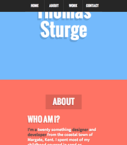
- Tweak of the background colours to increase contrast and readability
- Removal of some JS bloat
- Added post areas for articles and demos
- Added recent posts/demos widget for the front page
The update meant a full recode to implement the Jekyll/Liquid structuring I wanted to achieve. It was really interesting going over my old code and seeing the different ways I used to do things. For instance; I didn’t understand how to use the <section> element at all and used it as a shiney new <div> and not as the “sections” of articles within an <article> block, which is the correct use for them. Silly me…
The SASS was in a bit of a state too, again this goes down to me growing as a developer and finding my stride with the arrangement of CSS. Before I just put it in any order and didn’t regard the need to maintaining it, big mistake. I’ll follow this topic up with a post about my Personal Style Guide and why reasonings behind the styles I’ve documented.
Accessibility concerns
During the time I spent on this update I took sometime to work on the harsh colour scheme I had originally choosen the first time through. When I created the site I wanted it to be bright and eye catching, in the effort to produce that effect I may have gone a little far with the “eye catching” part and ended up with a palette that, in some places, hurt to look at for extended periods of time.
This time I used a service called Contact Checker that helped me work out the best balance on contract for light and dark text, while it may not be perfect it is a good step in the right direction to making the site a more pleasant experience. Especially if I’m to expect people to hang around long enough to actually read the articles I’m planning to publish.
During this reaserch and discovery I came to realise how little I regarded the subject of accessibilty and it made me sit up and start to paying attention to what I could learn. The site is a long way off from being a safe heaven for the impaired user but I’m going to apply changes as I learn more. I’ll be writing up my findings as I go in an attempt to help others discover what can be done to improve to Web for all.
What’s in store?
My main drive to update this site in the way I have is to give me a place to careful digest and articulate my thoughts and feelings about the things I’ve learned, and surely will learn, as I continue to grow as a developer. Some of the topics I have in mind are tutorials on the process I went through to create the refresh of this site, tips and tricks I’ve picked up on my journey as a professional and things I find interesting when I create projects and experiements with new technology and old alike.
This is all an exciting new adventure for me as I’ve only ever written one article in the past which was a slap dash tutorial about creating a CSS3 button. Seemed like a good idea at the time but I’d hate to see it now.
Closing words
To finish out this inaugural post for this shiny relaunch, I’d like to say that I’m looking forward to sharing my experiences and expertise with you in an effort to open rich forums of discussion that we all can benefit from. After all we are all growing from day to day in this industry and a little helping hand is always appreciated.
On that subject, if you have any feedback on the design of the site and how you think it could be improved, or maybe some ideas on interesting topics to look into and discuss then simple comment below, I’d love to hear from you.
If you would like to see how this site is created you can head on over to Github where I have all the files in a neat repository. Please keep in mind though that the code isn’t available to copy, they are there for educational proposes only.
Thank you for stopping by and come back soon for future articles